Data Visualization 101 for Non-Data Professionals
3/13/2019 Seth Appel

Business leaders are asked to glean actionable insights from data sights too vast and complex to readily understand. Capitalizing on the availability of data by producing clear and actionable insights persists as a common challenge.
Data visualization, however, has emerged as a key communication tool for enabling fully informed and optimized business decisions. It can liberate company’s data and quickly deliver it to leaders who can then transform lifeless data points into tangible actions and results.
Data visualization, defined
Data visualizations are images that use visual processing, rather than verbal processing, to enable viewers to quickly grasp meaningful and complex data insights.
The main purpose of a data visualization is to minimize the cognitive burden required to comprehend a data set. Think about it: scrolling through a large and complicated spreadsheet is hard work. But looking at a picture that accurately illustrates a data set is incomparably easier.
Most common uses of data visualizations
In its 2019 Business Intelligence Trends, Tableau says, “However much we automate, however big our data set, however clever our calculations, if you cannot communicate findings to others, you can’t make an impact with your analysis. This is the power of data visualization.”
Data visualizations are routinely used for three primary purposes:
- To explore the contents of a data set
- To communicate a key known takeaway from a data set
- To report the ongoing and evolving nature of a data set
Most business data visualizations fall into the third category in which operations is presenting oversight data for leadership to review for the purpose of informing ongoing business decisions.
When making a data visualization it is highly advised to:
- Define the purpose of the visualization
- Ascertain if the required data is available
- Commence with the visual design
Defining the purpose and goal of a visualization before all else will help best utilize the overall time invested and display output in a way that’s not overwhelming.
[FREE WHITE PAPER] The Problem with Not Putting First Party Data First
A better data visualization
A picture is worth a thousand words ? especially when you are trying to understand and discover insights from data. Visuals are especially helpful when you’re trying to find relationships among hundreds or thousands of variables to determine their relative importance — or if they are important at all.
When sophisticated analyses can be performed quickly, even immediately, the results need to be presented in ways that are easy to consume while allowing queries and exploration. This enables people across all levels of an organization to dive deeper into data and to use the insights for faster, more effective decisions.
So, the immediate purpose of data visualization is to improve understanding. The ultimate purpose? Enable better decisions and actions.
Most common data visualization types
When it comes to picking a visual frame for presenting data, non-data professionals can be overwhelmed by the options available. Here are a few greatest hits that can be used repeatedly for nearly all data presentation needs.
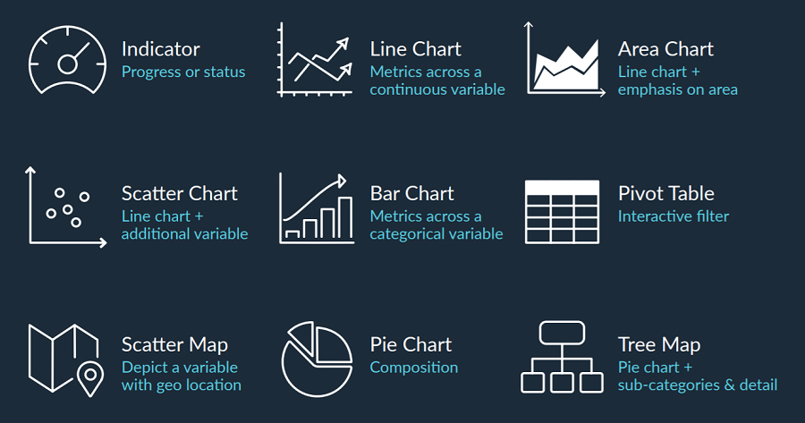
Once familiar with their core distinguishing traits, picking the right format for a particular data situation is simple.
Data visualization essentials
As data collection and preservation becomes cheaper, the range of business decisions required to be backed by quantifiable evidence will expand. Because of this, over time we’ll see the disappearance of “non-data professionals.”
Ultimately, everyone will become a data scientist of sorts and be expected to possess some degree of data fluency. Having said that, these four key points to consider when using data visualizations in a presentation to galvanize support for a decision or transformational initiative remain essential:
- Reliable. Have you vigorously kicked the tires on the veracity of your source data? Is there enterprise wide alignment on the metric definitions and parameters for success used?
- Clear. Is your core data thesis digestible and comprehensible within a few seconds? If not, back to the drawing board!
- Available. Have you made key data reports disseminated to all relevant stakeholders? Vital dashboards with metrics for performance are of little use if not made readily accessible to all decision makers.
- Beautiful. Last but not least, does your data presentation, dashboard or visualization look good?
The need to grant data presentations the authority of good visual design and beauty is often neglected by accomplished data analysts who spend more time in the world of mathematical absolutes than the world of subjective personal charm. A good looking visualization will turn heads and provide your analysis an extra degree of gravitas and respect. As the old adage goes, beauty is power.
Here are some points to consider when assessing the artistic component of any data visualization:
- Headlines. Does your visualization present top and most commonly used data takeaways front and center? And then proceed in an organized fashion to more specialized data needs afterwards?
- Colors. Does your visualization use colors effectively and in a consistent manner to assist viewers in making effective comparisons quickly with little effort?
- Icons. Does the visualization use unique symbols to create cognitive shortcuts in tracking data streams across time periods or other continuous variables?
- Movement. Do design elements take into account the most likely path of the viewer’s eye to thoughtfully sequence the presentation of data elements?
- Minimalism. Does it present the largest amount of ideas possible in the smallest amount of space and with the least amount of ink?
- Integrity. Does the visualization refrain from detrimental distortions like a truncated “Y” axis or a confused pie chart?
Do not forget the human element
Data visualization is primarily enabled by skills — the human part of the equation — and these skills are only augmented and not created by technology. The human component is primary, but sadly it receives much less attention than the technology. For this reason, truly good data visualization is rare.
The path to effective data visualization begins with the development of relevant skills through learning and a great deal of practice. Tools are used during this process but they do not drive it.
A data visualization works when designed by a person who understands how humans interact with data. This requires a sophisticated understanding of human perception and cognition. It also requires an understanding of what humans need from data.
Interacting with data is not useful unless it leads to an understanding of something that matters.
For this to happen, data should be displayed in ways that are both beautiful and functional without compromising either. Peoples’ attention must first be captured before their minds can be informed, and this can and should be done in a way that maintains the integrity of the information.
By harnessing the power of visual processing, you can greatly assist leaders in comprehending and acting on complex data sets.
Seth Appel is Vice President of Productivity Solutions and Product Management for Iridio by RRD.